Penland Auction 2012
 |
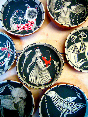
| I apologize that I didn't have the time or patience to try and figure out out to get rid of the watermark. This is my collaborative donation for the auction this year. Paulus Berensohn made the pot, and I did the surface treatment. I liked it a lot from the beginning, but I think the red really surprised him. Eventually, I hope he made peace with it! It reminds me of an ember. Grey but glowing... |

Comments